 August 20, 2026
  3 min read
Open your website on a laptop and it may look perfect. Now open it on your phone.
Suddenly the headline is six lines long, the navigation has disappeared into a hamburger menu, the form feels impossible to complete and the hero image has pushed the useful information far below the fold.
This is the difference between a website that merely responds to screen size and one that has genuinely been designed for mobile.
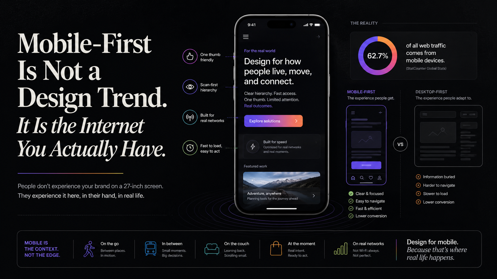
Mobile is no longer the secondary version of a website. Google uses the mobile version of a site’s content for indexing and ranking, which means businesses should stop treating mobile as something to check after the desktop version has been approved.
A responsive website can technically resize and still provide a poor experience. Good mobile-first design requires rethinking hierarchy, not simply shrinking elements.
What information should appear first? Which call-to-action matters most? How many navigation choices are really necessary? Can the form be shorter? Does the animation deserve so much screen space?
Mobile is very good at exposing clutter because there is nowhere for unnecessary information to hide.
At the same time, mobile should not become a stripped-down version of the website. Google recommends maintaining equivalent primary content across desktop and mobile. The objective is not to remove useful information, but to present it more intelligently through better hierarchy, accordions, progressive disclosure and simpler layouts.
Mobile users also behave differently. They may be commuting, walking, comparing prices in a shop, holding a coffee or using the phone with one hand. They may be distracted by calls and notifications while trying to complete a form.
That changes how interfaces should work.
Buttons need to be easy to tap. Forms should use sensible defaults. Phone numbers should be clickable. Input fields should display the correct keyboard. Important actions should never require surgical precision.
Speed matters even more on mobile because devices and network conditions vary dramatically. A giant image or unnecessary script is not simply a technical inefficiency. It can delay the visitor from understanding what the business actually offers.
Mobile can also change how people convert. A desktop visitor may happily complete a long enquiry form. A mobile visitor may prefer to call, send a WhatsApp message, book a meeting or save the page for later.
The goal can remain the same while the interaction changes.
This is why mobile-first design is ultimately an exercise in prioritisation. A smaller screen forces businesses to decide what really matters.
And that often improves the desktop experience too.
A homepage containing eight competing messages did not become confusing when it reached mobile. It was already confusing. Mobile simply exposed the problem.
Mobile-first therefore does not mean designing for phones simply because Google recommends it.
It means recognising that customers experience brands across different devices, locations, network conditions and levels of attention.
Design the smallest useful experience first.
Then expand.
Because the web no longer waits for customers at a desk.
It travels with them everywhere.
Your business should be able to do the same.